Unoriginal Things

An investigation of the Broadway-Fillmore district, Foederer’s project for Unoriginal Things began with a simple observation. What was once a thriving working-class neighborhood with a dense housing fabric, had become irreparably changed through a sustained effort by the City of Buffalo to purchase derelict homes and subsequently demolish them.
Gallery
This paradigm, not unique to Buffalo, was done without a plan for what this entirely new urban condition ought to be in the future, thus leaving a place characterized by a deteriorated housing fabric and an emergence of linked green space that weaves through it.
The aim of the project then became to argue for the validity of a new, looser urban fabric, and a rejection of the overly optimistic expectation that with enough time the original character of this, and similar neighborhoods, will be restored.
Shaping experience is the fundamental role of the designer
– Tom Foederer, MArch
The project began with an analysis of some of Buffalo’s typical urban forms. Included in this field work was Guercio and Son’s, a grocery retailer in West Buffalo. The building, as it exists today, is an aggregation of previously separate storefronts tied together with several other volumes that comprise an extensive back of house operation. This building represents a simple yet compelling idea of what can happen to existing architecture when it optimizes underutilized space. This concept of reuse and adaptation became an inspiration for the project, and an informant on formal manifestations.
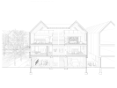
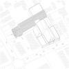
The project is an experiment at multiple scales; the scale of the neighborhood and the scale of the individual unit. The overarching goal of the project was to provide a new residential development at the epicenter of the Broadway Fillmore district, that represented the paradigm of the surrounding neighborhood.
In this sense, the overall plan for the site mimicked the shifting void spaces that characterized the area, and began to offer a continuity for pedestrian movement through itself, while furthermore beginning to posit how these spaces could be utilized and programmed for public use. Reserving a shared space for circulation while optimizing the overall dimensions and material character, allowed for a maximization of programmatic malleability.


